Link up with us on social media
Tips for creating the perfect website hero section

All of us have been there at some point. Something intriguing catches your eye while you’re surfing the web. A compelling ad or fascinating social post may promise to solve a problem you’ve been experiencing.
Curiously, you click on the web address and discover that the address is unfamiliar.
Once you arrive, though, the page loads, and you’re completely lost. Despite seeing the company’s name and logo, you have no idea what it does and whether its products and services apply to you.
What is the average amount of time you spend clicking around? Five seconds? 15 seconds?
What this article identifies about the HERO section of the website
Interestingly, 55% of people will leave a website in less than 15 seconds if it doesn’t capture the user’s attention. That’s why it’s critical to have a hero message on your homepage that instantly engages your visitor, explains who/what/why, and urges them to continue on your site. If you arent sure exactly how to do this, you’ve come to the right place.
We’ll take some time to walk you through our process to create hero banners for our customers, as well as let you know about a couple of best practices that you can take into consideration when designing a hero section on your own.
WHAT IS A HERO SECTION?
A hero section is a large full-screen banner across the top of your website that uses an image or video to capture the attention of your visitors, quickly explain who you are and what problems you can solve for them. The most effective way to do this is by including my hero images within the content itself.
The first step I take is to scour the internet or my collection of stock photos pertaining to my business. I then save these potential hero images in folders and review them when I create a hero section.
There are plenty of sample hero sections that you could grab from online repositories. Still, I’m using my hero images because they grab immediate attention with their visual appeal, which helps lead viewers through their journey on my site. This also allows users to decide whether they want more information about my company based upon how well I’ve executed my message within these banners.
What makes me different from other companies? Is there something unique about my brand compared to competitors out there? When writing marketing material like blog posts, my hero message includes my USP (unique selling proposition). If I can’t communicate how my product or service is unique, why would my audience choose me over someone else?
I like thinking of my blog posts as mini landing web pages. Remember that people are coming from search engines and social media platforms; they already know what they’re looking for since it is listed in the SERPs/titles within these sites. Therefore, the headline needs to clearly state what you offer so your user knows whether it’s worth checking out further. Here’s an example: “Beach Waves Without Salt Water” – this tells viewers exactly what’s included on this page.
So in crafting a unique Hero section, its best to ask yourself:
- What makes my company different than other companies?
- Is there something noteworthy about my brand compared to competitors out there?
- And what is the purpose of the page I’m creating?
- Who is it for?
- What is it for?
- When should buyers access this page?
- Where are they typically accessing this page from?
- Why is this important?
WHY IS A HERO SECTION IMPORTANT?
Often the Hero section is the first thing your visitors see when they land on your homepage.
If it doesn’t capture attention or answer the visitor’s question within a few seconds, they’ll hit that back button and look elsewhere.
But if your Hero section is well-written and captures visitors’ attention with a powerful headline/slogan of sorts – then you’ve got them hooked! They’re going to want to learn more about what services are offered, etc.
So without further ado… Here are my top tips for writing a compelling hero message:
These four questions will help guide you toward crafting something interesting enough to make people stop in their tracks when landing on your homepage. And once folks have stopped scrolling through all of those other pages out there vying for their eyeballs – this page should be the one to satisfy their initial inquiry/curiosity.
- Does my image clearly express the purpose of this specific page?
- Does my wording give evidence that I understand what a potential visitor might be looking for when browsing this specific page on the site?
- Is my call to action CTA appropriate and intriguing?
- Overall, is the hero section appealing and appropriate to the audience that I’m trying to attract?
Research shows that it takes no more than 50 milliseconds for users to form an opinion about a site. Even more so, 75% of web users admit to judging a company’s credibility based solely on the design of their site.
So, your hero matters because when users see your hero, they do not just see an image- they’re looking at a reflection of who you are and what you have to offer.
In my hero section on my website homepage, my goal is to immediately engage my visitors through concise wording that quickly divulges the who/what/why in less than three seconds so that users know exactly where I stand before scrolling down any further. With this being said, my title should be clear and straightforward to convey a confident tone while simultaneously making it easy for potential clients or customers to search out information about me online without having much trouble.
What is the purpose of the hero message in web design?
Your website’s hero message is the first piece of text your visitor sees when they arrive at your site’s homepage, often known as a “hero statement,” “welcome message,” or “homepage message.”
The hero message is generally composed of a big headline, a few lines (slightly smaller in size) to clarify matters, and a call to action that invites your prospect to do something on your site, such as watching a product demonstration video or getting in touch with you to learn more.
This is your chance to introduce yourself and your brand to your reader.
Your hero message should explain the following (in under 5 seconds):
- Who you are as a company (your industry or niche)
- What you do (a summary or your product offering or services)
- Why the visitor should care about your offer (how it can help them or make their life easier)
Your hero message should include the following: who you are, what you do, and why you’re doing it.
- Establish credibility and trust
- Help your visitor quickly determine if your website, product, or service will be beneficial to them.
- Build trust through a compelling call to action (the call to action is the most crucial “next step” you want visitors to take on your site) that entices your user to do what you want them to.
What your hero message shouldn’t be
It’s not a good idea to be vague or clever in your hero message. It’s not the place to use trendy jargon or industry buzzwords that are hard for most people to grasp.
Because you have so little time to sell yourself, you must communicate the value of your product or service clearly and concisely. If you want to be more playful with your header text, make sure your hero’s follow-up sentence(s) provide more information about the value of your offering.
You don’t need to create something earth-shattering or inspiring with your message to influence your visitors to take the next step on your site.
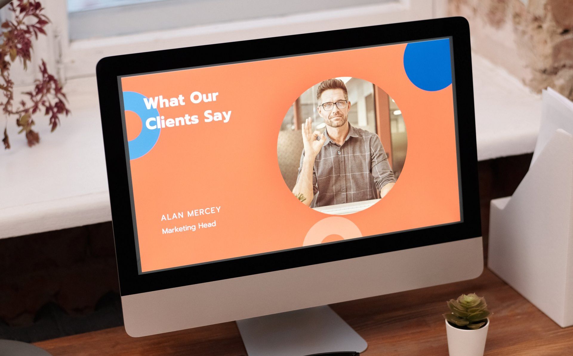
What about your HERO image?
The hero image on your website is the massive, high-resolution photo that sits at the forefront of your homepage. Some hero images take up the entire page, while others are aligned left, right, or sit atop the fold (the visible portion of a webpage when it is not scrolled down).
The primary goal of your hero image is to pique your visitor’s interest. People are visual creatures that respond favorably to eye-catching, high-quality images on aesthetically pleasing websites.
Consumers can tell if a design is fresh or out-of-date almost immediately. Your hero image assists them in determining whether your firm is trustworthy and up to date.
The hero image might be used to promote your product, provide additional information about your subject, or even elicit an emotional response from your visitor.
What are the best hero images for conversions, then? Here are three different types of high-converting hero images we frequently utilize for our clients:
1. Product-based Hero
This is an excellent choice for displaying your top-selling product, calling attention to a new one, or spotlighting a particular advantage of buying from you. Typically, we would put a high-definition photo of your top-selling product in the forefront so that your visitors have easy access to your store and that product specifically.
A call to action for this specific hero type could be “Buy now” or “Visit the store to learn more.”
2. Contextual Hero Image
A hero image tied to the context of your content helps your audience comprehend how to utilize your product or service and how it may benefit their lives.
Often a contextual hero section has complementary imagery that gives a use case for the specific brand or service you may offer.
For example, you could put a new mom at home with her baby and your product (bottle drying rack) next to the sink.
A hero message for this type of content may read, “Keep my hands free so I can care for my newborn” or something similar.
3. Emotion evoking hero
This option works well when trying to capture attention with an emotional message. Some websites, centered around children, pets, family, holidays, or even crises, call for more emotive messaging and imagery.
A call to action for this specific hero type could be “Take action” or “Learn more.” Remember, if you can make your visitor feel something when they look at your hero, you have a better chance of compelling them to take action.
Can sliders be of good use when creating a Hero section?
You might be tempted to have a picture carousel or slider on your website, which changes images every few seconds. However, we strongly advise you against it. While they may appear attractive, and you may be enticed to give them a try, the data does not support your decision.
In a study at the University of Notre Dame , only 1% of all visitors to the carousel saw each image. Only the very first slide was viewed by 84% of those who visited and clicked on it.
After conducting hundreds of usability tests, London-based testing firm WhatUsersDo’s Lee Duddell had the following to say about image sliders:
“They are next to useless for the user experience and often ‘skipped’ because they look like advertisements. Hence, they are a good technique for getting useless information on a homepage… Use them to put content that users will ignore on your homepage. Or, if you prefer, don’t use them. Ever.”
It may be more advantageous to use a single image that encapsulates the purpose for that individual page and not the business as a whole.
Why do many website Hero Sections not work
Why they don’t work:
- The problem with some website hero sections is that they focus merely on the title. There’s no meaningful value to any of these names, such as “Leading,” “innovator,” or “next generation.” Some of them include a slew of buzzwords like “leading,” “Visionary,” “innovator,” and so on. If you came here looking for a specific service, product, or article, that should be identified in the page’s title without too many descriptors.
- They are business-centric, rather than customer-centric: Using terms such as “we” and “us” are great if you are trying to compete with your client, but if you want to attract your client to your business, use terms such as “You/Your” that way your customer feels like the information that they are reading is for them.
- They use passive voice: “What drives us.” “What empowers us.” This kind of copy doesn’t encourage the reader to go further since it’s non-active rather than active. Instead, give the user something to do; they came to the page for a reason, so you should ensure that the call to action in your text tells them what to do next clearly and quickly.
- The hero image is irrelevant: Ensure that the background image you use is appropriate and lends to the message you have chosen to attach to it. Remember, don’t use a slider, and chose an image that directly speaks to the purpose of that specific page, not the whole business.
What does all of this mean?
It is possible to create a Perfect Hero section that is easy to read and uses the latest design trends. However, many web design companies can assist with this process; check out some of our work to see examples of how you can structure a great Hero section.
After reading this, you discovered that it takes users just 0.05 seconds to form an opinion about your website. Your prospects will assess whether your site is up to date, trustworthy, and relevant in the blink of an eye. Then, they’ll decide whether or not to get more information by looking at your products and services.
That’s why it’s critical for the various parts of your hero – your message, image, and call to action –to collaborate and contribute to the overall user experience or UX design. This will capture the attention of the users immediately and communicate your value.
We know how to create hero messages that inform, persuade, and make a lasting impact as web design professionals. Contact us today to discover how we may help you reach your business goals and designing your professionally branded website.

Darren Chambers
Digital Marketing/ Web Development Specialist
TWD of Atlanta, GA
Post Published on: